January 31, 2026 · V&V · 10 min read
The Ultimate Business Card Design Guide for Puerto Rico Businesses
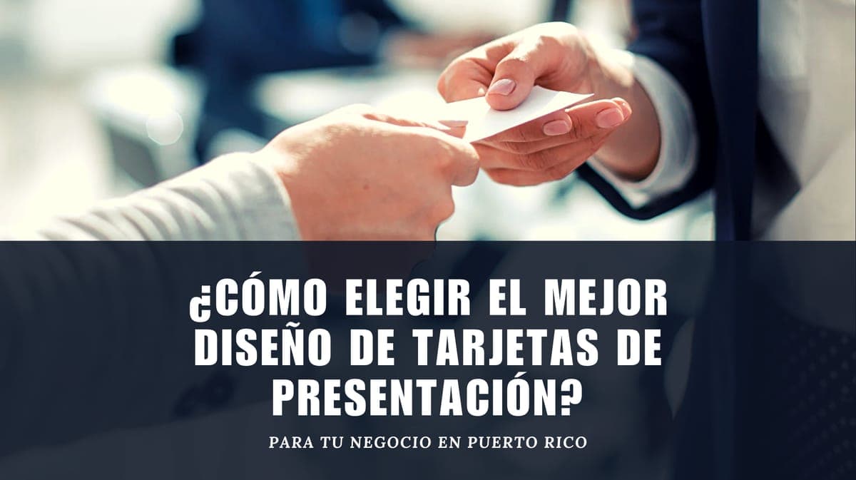
Even in a world dominated by smartphones and LinkedIn, the business card remains one of the most powerful networking tools in Puerto Rico. A well-designed card does more than share your contact info—it’s a tangible reminder of your brand that fits into a wallet, a purse, or a desk drawer. For local entrepreneurs, that first physical impression can be the difference between a quick glance and a lasting connection.
Why a Thoughtful Card Still Opens Doors in Puerto Rico
In Puerto Rico, face-to-face networking is still the engine of small-business growth. From industry expos at the convention center in San Juan to trade fairs in Bayamón, Caguas, and Ponce, the “conocido del conocido” culture means a personal introduction often comes with a business card. Handing over a cheap, cluttered, or poorly printed card signals disorganization, while a crisp, well-designed card shows you take your business seriously.
A local card also needs to speak to Puerto Rico’s bilingual and cross-industry environment. You might be handing it to a corporate buyer in Hato Rey, a tourist in Old San Juan, or a wedding planner in Aguadilla. The right design helps you bridge these contexts without saying a word.
Nail Down Your Goal and Your Audience First
Before you pick a color palette or font, ask yourself: What is the primary action you want someone to take after receiving your card? Your answer determines which information gets visual priority.
- If you need immediate contact via WhatsApp, your phone number and the WhatsApp icon must be impossible to miss.
- If you want to drive traffic to your website or online booking, place a QR code or a bold URL on the front.
- If your goal is to schedule in-person consultations, include your address and a brief value proposition (“Free consultation” or “Open 6 days a week”).
Equally important is identifying who will receive that card. Puerto Rico’s business landscape includes three broad audience profiles:
- Local consumers: Typically Spanish-dominant, they respond to warm, trustworthy designs with clear contact details.
- Tourists and visitors: English proficiency is common. Cards for hotels, tours, and restaurants should be bilingual or at least include key information in English, and they can lean into vibrant, island-inspired visuals.
- B2B and corporate clients: They expect a refined, no-nonsense design that conveys stability and competence.
When your goal and audience are clear, design decisions become easier and your card becomes a genuine business tool.
Design Essentials That Communicate Professionalism
Three elements work together to tell your brand story on a 3.5- by 2-inch canvas: your logo, typography, and color palette.
Logo: Your logo is the visual anchor. It must be high-resolution, surrounded by enough white space, and placed where the eye lands first. If you have a brand style guide, follow it. At V&V Fast Print, we often help clients adjust their existing logo files to make sure they print sharply at a small scale.
Typography: Stick to two typefaces at most. Contact details should never dip below 8 point type. Sans-serif fonts feel modern, while serif fonts can suggest tradition. Avoid script fonts for body text.
Color: Your palette should reflect your industry. Deep blues and grays project trust for law firms and accountants. Energetic yellows, turquoises, and fuchsias suit restaurants and tourism. Earth tones and greens work for wellness and organic brands. Limit your palette to two or three dominant colors to keep the card cohesive.
Required Information: Every card should include your full name, job title, company name, phone (with +1 787 or 939), professional email, website, and physical address if you welcome walk-ins. Pick one or two social media handles and use their recognizable icons. Overloading the card dilutes the design.
To see these principles in action, browse our gallery of past work.
Industry-Specific Styles That Resonate Locally
- Lawyers, accountants, and consultants: Minimalist layouts with generous white space, dark navy or charcoal, and simple serif fonts project authority. A subtle embossed logo or a thin foil accent can elevate without flashiness.
- Restaurants, tourism, and hospitality: Tropical motifs, pastel or bold accent colors, and bilingual text bring warmth and practicality. A wave pattern or a fork-and-spoon icon can tell your story quickly.
- Beauty, fashion, and wellness: Soft pastels, metallic foils, and stylized but readable typography appeal to an aesthetic-focused clientele. A matte finish with spot UV gloss on a logo adds a high-end touch.
- Creative freelancers and artists: Vertical orientations, asymmetrical layouts, textured papers, and a mini portfolio on the back side differentiate you instantly. Just keep contact info easy to find.
Matching your card’s style to your sector helps you blend in when reliability matters and stand out when creativity counts.
Format, Paper, and Finishes That Leave a Lasting Impression
Size and orientation: The standard 3.5” × 2” card fits wallets and cardholders. Horizontal orientation is classic and easy to read; vertical feels more contemporary and stands out in a stack.
Paper weight: Choose at least 300–350 g/m² (14–16 pt cover) for a substantial feel. Matte paper suits a sophisticated, writable surface; gloss or satin finishes make colors pop.
Premium finishes: – Lamination adds durability. – Spot UV highlights specific areas. – Embossing/debossing creates tactile texture. – Rounded corners offer a softer profile and resist dog-earing.
Designing both sides: Use the front for name, title, company, and a strong visual element. Reserve the back for detailed contact info, social icons, a QR code, and a value statement (“Delivery all over Puerto Rico,” “24/7 online booking,” “Family-owned since 1994”). A double-sided card doubles your communication space without increasing size, making your card feel intentional and premium.
At V&V Fast Print, we work with you to match paper stocks and finishes to your brand identity. Our team in Hato Rey has been guiding businesses through these decisions since 1994—long enough to know what holds up in Puerto Rico’s humidity and what catches the eye during a busy Expo. If you already have a design, we’ll print it to perfection; if you need help from scratch, our in-house graphic design service can bring your vision to life.
Ready for your next project?
V&V Fast Print has been printing in Hato Rey for 30 years. Tell us what you need and we'll quote it.
Get a Quote